

Most absence programs die in the gap between "we noticed a problem" and "we did something about it." An employee crosses some invisible line, a manager gets a vague nudge from HR, a conversation happens (or doesn't), and three months later the same person is on the same trajectory. Nobody measured whether the intervention worked, because there was never a defined intervention in the first place — just a series of well-meaning reactions.
The reason tiered intervention design matters isn't that it sounds sophisticated. It's that chronic absence behaves like a slow leak — the longer you ignore it, the worse it gets. Reacting the same way to a first-time three-day absence as you do to someone on their fifth incident this quarter wastes effort in both directions. You over-manage the people who don't need it and under-manage the ones who do.
This is a systems problem. The trigger has to connect to a specific action, the action has to connect to a measurable outcome, and the outcome has to feed back into whether you keep doing it. Break any one of those links and you've got activity without impact — which, for anyone trying to justify the cost of an EAP or an absence program to a CFO, is the worst possible position to be in.
Why tiering matters more than the interventions themselves
A pattern shows up repeatedly: companies invest in the interventions — EAP, occupational health referrals, return-to-work coaching — but skip the routing logic that decides who gets what and when. The result is that everyone gets treated as either fine or a problem, with nothing in between.
Real absence data almost never looks like two clean buckets. It looks like a gradient. You've got a large group with normal, occasional absence, a middle band where patterns are starting to form, and a small tail where absence is either serious, chronic, or masking something bigger. Treating that gradient with a single response is where most of the money gets wasted.
A tiered model exists to match the cost and intensity of your response to the stage of the problem. A gentle check-in costs almost nothing and works well early. An EAP referral, occupational health assessment, or formal absence review is expensive in time and relationship capital — it only pays off when the situation actually warrants it. Get the tiering right and you spend your expensive interventions on the cases where they actually change the outcome.
If you've already built an absence-driven risk model or burnout detection thresholds, tiered intervention is the layer that sits on top. It's what you do once the pattern detection tells you something's happening.
Trigger-to-action maps: the part everyone skips
A trigger-to-action map is exactly what it sounds like — a defined condition that, when met, fires a specific action owned by a specific person within a specific window. The discipline is in removing ambiguity. "Manager should have a conversation" is not an action. "Manager holds a documented return-to-work conversation within 48 hours using the standard prompts" is.
Stop managing absences manually.
Absencely simplifies leave requests, approvals, and absence monitoring for your entire workforce.
- Automated leave tracking
- Manager approval workflows
- Compliance & reporting tools
No credit card required
Below is a working example of a three-tier map. The exact thresholds should be calibrated to your own baseline — a warehouse with heavy manual roles will have a different normal than a back-office team — but the structure holds across industries.
| Tier | Trigger condition | Action | Owner | Window |
|---|---|---|---|---|
| Tier 1 (early) | 3 short absences in a rolling 90 days, OR any single absence over 3 days | Documented return-to-work check-in, supportive tone, no formal record | Line manager | Within 48 hrs of return |
| Tier 2 (pattern forming) | 5+ incidents in 6 months, OR a Bradford-style score crossing your mid threshold | Structured wellbeing conversation + EAP signpost + light occupational health screen if health-related | Manager + HR partner | Within 5 working days |
| Tier 3 (chronic/serious) | Ongoing absence, repeated Tier 2 with no improvement, or absence flagged as health/stress-driven | Formal absence review, EAP referral logged, occupational health assessment, adjustment planning | HR lead + occupational health | Within 10 working days, reviewed monthly |
A few things worth noting about how this map behaves in practice.
The trigger conditions have to be automatically detectable from data you already hold. If your only way to know someone hit Tier 2 is for a manager to remember and count in their head, the map won't fire. This is where most programs quietly fail — the logic exists on paper but nothing surfaces the trigger at the right moment. An operational absence platform that watches rolling windows and flags the crossing is what keeps the action window starting on time instead of three weeks late.
Ensure your platform can flag rolling-window triggers automatically so the map fires without relying on manager memory.
The tone shift across tiers is also deliberate. Tier 1 is genuinely supportive and non-punitive, because escalating too fast is how you turn a minor issue into a resentment problem. In real operations, the fastest way to increase absence is to make people feel policed for a couple of legitimate sick days.
Each tier should also have a de-escalation path, not just escalation. Someone who hits Tier 2 and then improves should drop back down. Programs that only ratchet upward create a one-way trap where anyone who had a rough quarter is permanently marked.
Where EAP integration usually goes wrong
The EAP is the intervention most companies pay for and least connect to their actual workflow. You buy the service, it sits behind a phone number and a portal, utilization hovers somewhere around 3-5%, and chronic absence keeps climbing. The disconnect is that nobody routes the right people to it at the right moment.
Integrating EAP into the tiered model means two specific things. One: the EAP signpost or referral is a named action at Tier 2 and Tier 3, not a poster in the break room. Two: you have a feedback loop — within privacy limits — that tells you whether referrals are happening and whether referred employees show any change in absence pattern afterward. You'll never get individual clinical detail, and you shouldn't. But you can track referral counts, uptake rates, and aggregate absence trends for the referred cohort versus a comparison group.
-
Data surfaces a Tier 2 trigger for an employee.
-
HR partner holds the structured conversation and, where appropriate, makes an EAP referral — logged against the case with a date.
-
The referral cohort is tracked in aggregate
uptake rate, and absence days in the 90 days before versus the 90 days after referral.
-
That cohort's trajectory is compared against a matched group who hit the same trigger but weren't referred (or were referred later), giving you a rough read on impact.
-
The delta feeds your ROI calculation against EAP cost per referral.
That fifth step is what turns "we have an EAP" into "our EAP prevented roughly X absence days last quarter, worth roughly Y." For the finance side of that math, pairing this with a proper cost-per-absence model and ROI workbook is what makes the number defensible rather than a guess.
KPI hypotheses: state what you expect *before* you start
The single biggest reason intervention programs can't prove their value is that nobody wrote down what success would look like beforehand. After the fact, everyone reinterprets whatever happened as evidence the program worked (or didn't). A KPI hypothesis fixes this by forcing you to commit in advance.
-
If we run Tier 1 return-to-work check-ins within 48 hours, then repeat short-term absence within the next 90 days will drop by roughly 10-15% for that group.
-
If we route Tier 2 cases to EAP referral, then absence days in the following quarter for the referred cohort will fall by around 20% relative to the pre-referral quarter.
-
If we formalize Tier 3 reviews with occupational health input, then the conversion rate from long-term absence to sustained return-to-work will improve noticeably over six months.
These aren't precise to the decimal — they're honest ranges. The point isn't to be exactly right, it's to have a stake in the ground you can measure against. If the actual result comes in wildly off from the hypothesis in either direction, that's information. Overshooting the prediction can be as telling as missing it; sometimes it just means your baseline was worse than you thought.
Sample KPI definitions
Vague KPIs are useless, so define them tightly. A few that hold up:
-
Repeat short-term absence rate — % of employees who had a short-term absence in a period who have another within the following 90 days. Watch the denominator carefully; it should be people at risk of a repeat, not the whole headcount.
-
Bradford-style frequency score — weights frequent short absences more heavily than single long ones. Useful for surfacing pattern-formers, but don't use it as a punishment trigger in isolation.
-
EAP referral uptake rate — % of employees offered an EAP referral who actually engage. Below roughly 30% usually means the referral is being made mechanically rather than in a genuine conversation.
-
Time-to-action — hours or days between trigger firing and the owner completing the required action. This is your process-health metric; if it drifts, everything downstream degrades.
-
Return-to-work sustainability — % of returns from long-term absence that hold for 90+ days without a relapse. This is the one executives actually care about, so give it weight.
If you're building the executive-facing view on top of these, a prioritized KPI scorecard with a proper target-setting method keeps the reporting from turning into a wall of numbers nobody reads.
A test-and-learn experiment template
You don't roll a tiered program out across the whole company on day one and hope. You test it on a slice, measure honestly, and scale what works. Here's a template that survives contact with real operations.
Structure of a single experiment:
-
Hypothesis — the directional prediction (see above).
-
Population — which group gets the intervention. Ideally a specific department, site, or manager group so you can isolate the effect.
-
Comparison group — a matched group that doesn't get the new intervention yet, or gets the old process. Without this you can't tell whether any change was your intervention or just seasonality.
-
Primary KPI — the one number that decides success.
-
Secondary KPIs — supporting signals (uptake, time-to-action, manager compliance).
-
Duration — long enough to see an absence effect, usually a full quarter minimum, often two.
-
Decision rule — written before you start
"If primary KPI improves by X or more with no adverse secondary signal, we scale to the next group."
The comparison group is the part everyone wants to skip and shouldn't. Absence is seasonal and noisy. Flu season, a reorg, a busy trading period — any of these can move your numbers more than your intervention did. If you only look at before-and-after for the treated group, you'll confidently credit or blame your program for things it had nothing to do with. Even a rough comparison group cuts through most of that.
Reporting cadence
-
Weekly process metrics only — time-to-action, trigger volume, action completion rate. These move fast and catch a stalling rollout early.
-
Monthly intervention outcomes — referral uptake, Tier progression and de-escalation, early absence-rate signals.
-
Quarterly the real impact read — repeat absence rate, cohort comparisons, return-to-work sustainability, and the ROI update.
Reporting on outcome metrics weekly is a common mistake; the numbers are too noisy at that interval and you'll end up chasing random variation. The opposite mistake is reporting on process metrics only quarterly — by the time you notice managers stopped doing check-ins, you've lost a full quarter of data.
Here's a simple workflow to visualize the experiment cycle.
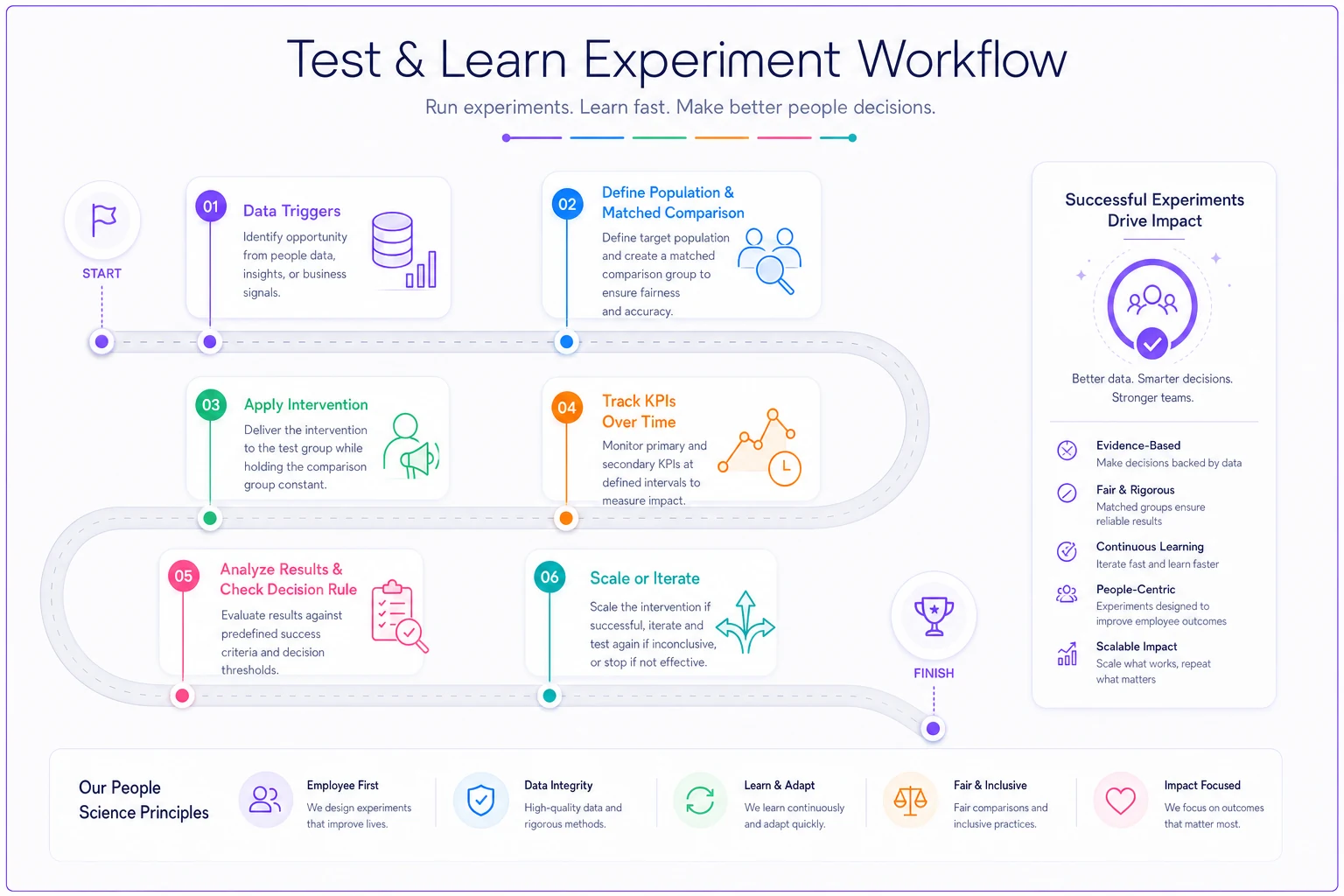
Use this cycle to keep experiments small, measurable, and reversible until you have a repeatable win.
A real scenario
A mid-sized logistics operation, around 400 staff split across two depots, had chronic absence sitting at roughly 6-7% against an industry-typical target closer to 4%. Their existing approach was a single formal warning process that kicked in late, felt punitive, and did nothing for the middle band where patterns were forming.
They introduced a three-tier map. Tier 1 became a quick, genuinely supportive return-to-work chat run by shift supervisors. Tier 2 added a structured conversation plus an EAP signpost. Tier 3 stayed formal but now included occupational health earlier. Critically, they tagged EAP referrals to the triggering cases and ran one depot as the test site with the other as a rough comparison for the first two quarters.
The results weren't dramatic overnight, but the direction was clear. Repeat short-term absence in the test depot dropped somewhere around 15-18% over two quarters, while the comparison depot barely moved. EAP uptake among Tier 2 cases climbed from almost nothing to roughly a third, because it was now offered in a real conversation instead of a leaflet. When they ran the referred cohort's absence days before and after against the comparison group, the prevented-absence estimate came out to a few hundred days across the period — enough that the EAP contract stopped being a line item they had to defend and became one they could justify with actual numbers.
The un-glamorous truth of why it worked: the triggers actually fired on time, because the data was being watched instead of remembered. Most of their previous "program" had existed only on paper.
When this makes sense — and when it doesn't
Tiered intervention is worth building when you have enough absence volume to see patterns and enough headcount that manual tracking has already broken down. Below a certain size, the overhead outweighs the benefit — a 30-person company owner usually just knows who's struggling, and formalizing it into three tiers adds bureaucracy without insight.
It also makes sense when you're paying for interventions you can't currently connect to outcomes. If you're spending on EAP or occupational health and can't tell whether they work, the routing-and-measurement layer is where you get that visibility back.
When it's a bad idea, or premature:
-
Your absence data is unreliable — inconsistent recording, missing reasons, manager-dependent logging. Build the data discipline first; tiering on bad data just automates wrong decisions.
-
You intend to use the tiers primarily as a disciplinary funnel. Employees read that intent instantly, and it backfires into hidden absence and lower trust.
-
You have no capacity to actually run the actions. A trigger map that fires actions nobody has time to complete is worse than no map, because now you have documented negligence.
Any organization that can't commit to the feedback loop should skip the tiering entirely and just make sure managers are having decent conversations with people. The whole value of the system is the measurement discipline — without it, you've built expensive process for its own sake.
Bringing it together
Chronic absence doesn't get solved by having the right interventions on the shelf. It gets solved by connecting the right trigger to the right action to the right measurement, so that your expensive responses land on the cases that need them and you can actually see what changed. The tiered map is the routing logic, the KPI hypotheses are your honesty check, and the test-and-learn template is how you avoid scaling something that only felt like it worked.
Each experiment tightens the next one. Thresholds get calibrated to your real baseline, EAP referrals get sharper because you can see which cases respond, and your ROI number stops being a hopeful estimate and becomes something you can put in front of finance without flinching. That's the difference between an absence program that generates activity and one that generates results — and most of it comes down to whether the links between trigger, action, and outcome are actually connected, or just assumed.
Each experiment tightens the next one. Thresholds get calibrated to your real baseline, EAP referrals get sharper because you can see which cases respond, and your ROI number stops being a hopeful estimate and becomes something you can put in front of finance without flinching. That's the difference between an absence program that generates activity and one that generates results — and most of it comes down to whether the links between trigger, action, and outcome are actually connected, or just assumed.
Ready to optimize your workforce absence management?
Join 2,000+ HR teams using Absencely to reduce administrative burden, improve compliance, and boost employee satisfaction.