
Most HR leaders I work with track absence rates religiously — usually somewhere between 3% and 8% across their workforce. But when I ask what their executive team actually needs to know about absence programs, they start pulling up 15 different spreadsheets trying to piece together a story.
The disconnect between what gets measured and what drives actual business decisions is massive. Your CFO doesn't care that unplanned absence went from 2.8% to 3.1% last quarter. They care that you're spending $1.2 million annually on overtime because absence coverage planning broke down. Your CEO doesn't need to know PTO accrual rates by department — they need to know if critical projects are at risk because three senior engineers are out simultaneously.
Building operational software across industries has shown me that absence programs fail when executives can't connect absence patterns to actual business outcomes. A manufacturing client in Ohio was losing roughly $45,000 monthly in productivity — not because absence rates were high (they weren't) — but because absence clustered in specific production areas on Mondays and Fridays, forcing expensive weekend overtime.
Why traditional absence metrics miss executive priorities
Standard HR dashboards love showing overall absence rates, average days out per employee, Bradford Factor scores. These metrics feel important because they're easy to calculate and benchmark. But they completely miss what executives need for real decisions.
The problem starts with how absence data flows through most organizations. HR tracks compliance and policy adherence. Payroll tracks costs. Operations tracks coverage gaps. Finance tracks budget impacts. Nobody connects these threads into a coherent operational picture. So you end up with executives asking "Why did labor costs spike 12% last quarter?" and HR scrambling to tie absence patterns to overtime spending to productivity losses.
Cost visibility gaps
Direct absence costs (sick pay, PTO payouts) get tracked, but indirect costs disappear into other budget lines. Overtime expense? Operational budget. Temp agency fees? Different cost center. Lost productivity from knowledge workers covering for absent colleagues? Never measured. A software company discovered their true absence costs were 3.4x what they thought once they mapped all the hidden expenses.
Service level blindness
Most organizations track whether someone is present or absent. They don't track whether critical functions maintained service levels during absences. A customer service center might show 5% absence — completely acceptable — while first-call resolution dropped 18% because their most experienced reps were out. The absence rate looked fine. The customer experience tanked.
Predictive failure
Historical absence reporting tells you what already happened. Executives need forward visibility — which departments are trending toward coverage problems, which patterns signal bigger issues, where costs will likely spike. Without that, you're always reacting.
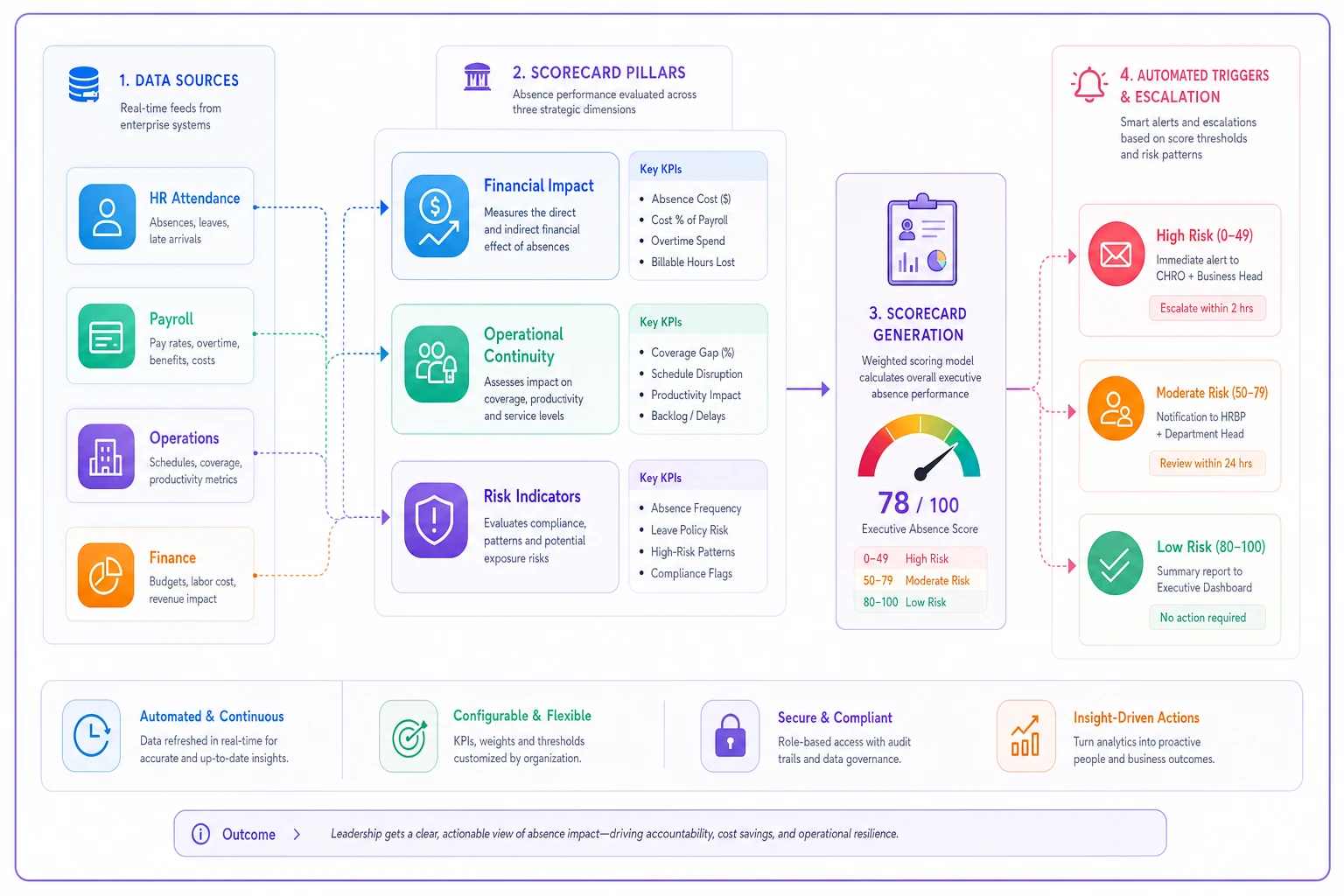
Building an executive scorecard that actually drives decisions
After helping dozens of organizations restructure their absence reporting, effective executive scorecards focus on three core pillars: financial impact, operational continuity, and risk indicators. Each pillar needs 2-3 specific KPIs that connect absence patterns to outcomes executives actually care about.
Stop managing absences manually.
Absencely simplifies leave requests, approvals, and absence monitoring for your entire workforce.
- Automated leave tracking
- Manager approval workflows
- Compliance & reporting tools
No credit card required
Here's a visual workflow of how data flows into the executive scorecard.
Financial Impact KPIs
Total Absence Cost Rate (TACR)
This goes beyond direct wage replacement to capture the full financial burden. Calculate it as:
-
Direct costs (sick pay, PTO, disability payments)
-
Indirect costs (overtime premiums for coverage, temp labor, contractor fees)
-
Productivity impact (measured as revenue per FTE variance during high-absence periods)
-
Divided by total labor cost
Target setting: Industry benchmarks put this around 8-12% of total labor cost, but your target depends on your business model. Knowledge work tolerates higher TACR (up to 15%) because individual productivity varies more than coverage-based work.
Cost Per Absence Day (CPAD)
Simple but powerful — total absence-related costs divided by total absence days. This metric catches expensive absence patterns. If your CPAD jumps from $420 to $580, something structural changed — maybe absences concentrated in high-wage departments or triggered more overtime than usual.
Target setting: Calculate your baseline CPAD, then set improvement targets based on controllable factors. Can't reduce wage replacement costs? Focus on reducing overtime premiums through better coverage planning.
Operational Continuity KPIs
Critical Role Coverage Ratio
Not all absences create equal disruption. Track the percentage of critical roles that maintained full coverage despite absences. Define "critical" based on customer impact, safety requirements, or project dependencies.
A logistics company started tracking this after losing a major client when their key account manager and backup were both out during a crucial negotiation. They now maintain 2.5x coverage for client-facing roles and 2x for operational positions.
Target setting: Minimum 95% coverage for customer-critical roles, 90% for internal operations. Anything below triggers immediate succession planning or cross-training investments.
Service Level Maintenance Score
Connect absence to actual service delivery. Pick 3-5 core service metrics (call answer time, order processing speed, project milestone completion) and track the variance during different absence scenarios.
| Absence Scenario | Service Impact | Acceptable? |
|---|---|---|
| <3% absence | No impact | Yes |
| 3-5% absence | 5-10% degradation | Monitor |
| 5-8% absence | 10-20% degradation | Intervention needed |
| >8% absence | >20% degradation | Crisis mode |
Target: Maintain 90% of normal service levels even at peak absence — usually 8-10% during flu season or summer vacation.
Risk Indicator KPIs
Absence Concentration Index
Measures whether absences cluster dangerously. Calculate the standard deviation of absence rates across departments and teams. High concentration means certain areas bear disproportionate absence burden.
One retail chain had a healthy-looking 4.2% company-wide absence rate, but three stores consistently ran at 11-14%, destroying customer experience and driving manager turnover. A concentration index would have flagged it months earlier.
Target: Keep standard deviation below 2.5 percentage points. Anything higher signals systemic issues in specific pockets of the organization.
Predictive Absence Warning Score
Combine leading indicators into an early warning system:
-
Rolling 30-day absence trend (weighted 40%)
-
Scheduled PTO density over next 60 days (weighted 30%)
-
Historical seasonal patterns (weighted 20%)
-
Team burnout signals from absence patterns (weighted 10%)
Score from 0-100, where anything above 70 triggers proactive intervention — bringing in temporary support or adjusting project timelines before coverage breaks.
Setting realistic targets without sandbagging
Target-setting for absence KPIs creates political landmines. Set them too aggressive, operations claims they're impossible. Too lenient, finance thinks you're sandbagging. The methodology needs to be defensible and tied to business reality.
Start with baseline measurement over 12 months to capture seasonal patterns. Don't just average — understand your variance. If absence costs swing between $80,000 and $140,000 monthly, that $60,000 variance matters more than the $110,000 average.
Next, segment your analysis:
-
What's controllable (coverage planning, absence clustering)
-
What's partially controllable (absence frequency through wellness programs)
-
What's uncontrollable (FMLA, regulatory requirements)
Set improvement targets only for controllable factors. A healthcare organization reduced their TACR from 14% to 11% purely by fixing coverage planning — they didn't reduce absence at all, just managed it better.
Focus initial targets on reducing variance (stability) rather than pushing for large absolute reductions in the first year.
Use stepped targets that recognize operational reality:
Year 1: Stabilization
Focus on measurement accuracy and process consistency. Target: reduce variance by 30%, even if absolute numbers don't improve.
Year 2: Optimization
With stable measurement, target 10-15% improvement in controllable costs through better planning and predictive absence forecasting.
Year 3: Strategic management
Shift from reactive to predictive. Target: 90% of absence impacts anticipated and mitigated before they affect operations.
Critical drilldowns executives actually use
The scorecard shows what's happening. Drilldowns explain why and what to do. But most organizations build drilldowns that answer HR questions, not executive questions.
Cost driver analysis
Don't just show that costs increased. Show which specific factors drove it:
-
Volume (more absence days)
-
Mix (absence concentrated in expensive departments)
-
Coverage method (overtime vs temps vs redistribution)
-
Timing (peak periods vs normal operations)
A distribution center found their Q4 absence costs spiked 40% not from higher absence but from timing — people took sick days during peak shipping when overtime rates were already at 2.5x normal wages.
Department variance investigation
When absence patterns vary significantly across departments, executives need to understand if it's:
-
Demographics (age, tenure, role type)
-
Management practices
-
Workload and stress levels
-
Local factors (commute, regional illness patterns)
Don't jump to "bad management" conclusions. One tech company discovered their engineering absence rate was 40% higher than sales not because of management, but because engineers could work remotely when mildly ill while sales required customer interaction.
Predictive scenario modeling
Show executives what happens under different scenarios:
-
"If flu season hits 20% harder than last year..."
-
"If we can reduce Monday/Friday absence clustering by 25%..."
-
"If we improve critical role coverage from 1.5x to 2x..."
Make the business impact tangible. Don't say "absence might increase 15%." Say "a 15% absence increase would require $340,000 in overtime spending or accepting 12% longer customer wait times."
The one-page executive report template
After iterating through dozens of versions with different leadership teams, here's the template that actually gets used in executive meetings:
Header Section (Top 20%)
-
Report period and comparison period
-
Overall Absence Cost Rate with trend arrow
-
Executive summary in one sentence
"Absence costs increased 12% driven primarily by warehouse clustering; mitigation plan reduces Q2 exposure by $180,000"
Dashboard Section (Middle 40%)
Three columns showing your six primary KPIs:
-
Financial
TACR: 11.3% (↑ from 10.8%); CPAD: $485 (↑ from $445)
-
Operational
Critical Coverage: 94% (↓ from 97%); Service Maintenance: 91% (→ from 91%)
-
Risk
Concentration Index: 3.1 (⚠ above 2.5 threshold); Warning Score: 68 (↑ from 45)
Insight Section (Next 20%)
-
Key driver of change
-
Recommended action with expected impact
Drill-down Preview (Bottom 20%)
-
Cost driver waterfall
-
Department heat map
-
90-day forward forecast
This fits on one page, prints clearly in black and white, and takes under 30 seconds to absorb the key message. Executives can ask for detailed drilldowns if needed, but the core story is immediately clear.
Making absence KPIs actionable, not just visible
Visibility without action is just expensive reporting. Every KPI on your executive scorecard needs clear action triggers and escalation paths.
When TACR exceeds target by 10%:
-
Finance and HR jointly review cost drivers within 48 hours
-
Identify top 3 controllable factors
-
Present remediation plan with 30-60-90 day milestones
-
Weekly progress updates until back within range
When Critical Coverage drops below 95%:
-
Immediate assessment of affected roles and business impact
-
Deploy emergency coverage protocols (pre-approved temp agencies, cross-trained backup activation)
-
Root cause analysis within 5 business days
-
Structural fix implementation within 30 days
When Warning Score exceeds 70:
-
Proactive communication to affected department heads
-
Review and adjust upcoming project timelines
-
Pre-position temporary support resources
-
Daily monitoring until score drops below 60
The key is making these triggers automatic rather than waiting for someone to notice and escalate. When operational software monitors these thresholds continuously, executives get alerts before problems cascade into crises — shifting the absence conversation from "what happened last month" to "what we're preventing next month."
A good test: if your executive team can't immediately name their top 3 absence KPIs and current performance against target, your scorecard isn't working. They should know these numbers like they know revenue and gross margin — not because absence is equally important, but because unmanaged absence directly impacts both.
Building organizational alignment around absence KPIs
The hardest part isn't calculating the metrics — it's getting different stakeholders to care about the same outcomes. HR focuses on compliance and employee experience. Finance wants cost control. Operations needs predictable staffing. Without alignment, you get competing narratives and no clear action.
Start by connecting each KPI to specific stakeholder interests:
For CFOs, frame TACR as "fully-loaded absence cost as percentage of labor spend" — language they already use for other operational metrics. Show how reducing TACR by 1 percentage point drops straight to EBITDA.
For COOs, position Critical Coverage Ratio as "operational resilience score" — their language for business continuity. Demonstrate how improving coverage reduces fire drills and emergency interventions.
For CHROs, link absence concentration to employee engagement and retention. High absence concentration typically precedes turnover spikes by 60-90 days.
Then establish shared accountability. Don't make absence KPIs purely an HR metric. The warehouse manager who allows absence clustering owns part of the CPAD increase. The department head who doesn't maintain adequate cross-training impacts Critical Coverage. When operational leaders see absence metrics as their metrics too, behavior changes quickly.
When operational leaders see absence metrics as their metrics too, behavior changes quickly.
Most organizations drown in absence data while executives starve for absence insight. The difference isn't more sophisticated calculations or fancier dashboards — it's focusing on the 6-8 metrics that actually drive business decisions and connecting them to outcomes executives already care about.
Your executive scorecard shouldn't try to tell the complete absence story. It should answer three questions: How much is absence really costing us? Can we maintain operations during realistic absence scenarios? What absence risks are building that we need to address now? When you nail these questions with clear KPIs, realistic targets, and actionable triggers, absence management shifts from an HR administrative function to a strategic operational capability. The goal isn't perfect attendance — it's predictable, manageable absence that doesn't surprise or disrupt the business. The businesses that get this right don't have lower absence rates. They have lower absence impact. They see patterns before they become problems, deploy resources before coverage breaks, and make tradeoffs with full visibility into the consequences. That's what an executive absence scorecard should enable — not just measurement, but genuinely better operational decisions.
Ready to optimize your workforce absence management?
Join 2,000+ HR teams using Absencely to reduce administrative burden, improve compliance, and boost employee satisfaction.